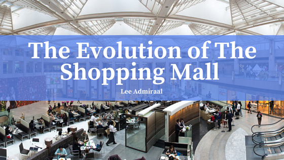
If asked fifty or so years ago to picture a typical mall, most people probably would have envisioned a blocky brick and mortar structure, it’s entrances equipped with dual, unassuming doors, leading into a skylight-brightened, modest, but (usually) boring space sporting large, wide, white halls lined with small shops sandwiched by department stores at the ends; at the mall’s center might sit an adorable little nature garden, all of this sprawled across two rather plain, escalator-connected floors.
Say Goodbye To Cookie Cutter Designs
Amid contemporary design trends, this cookie-cutter mall form seems a bit like old bubblegum; a historical footnote on the shoe of what may be accepted, or even expected from designers today: a more daring, free-form standard of commercial architecture. However, at the time of the first ever shopping mall’s creation, the “Southdale” mall standard was a pleasurable, a comfortable, covered place of safety.
Creating a practical sanctuary was original mall architect Victor Gruen’s objective, in fact, when he built America’s first commercial mall, Southdale in Edina, Minnesota (completed c. 1955), he did so with blast-proof steel and reinforced concrete, and equipped his mall with an independent generator, as well as an extensive underground subsection meant to double as a fallout shelter. Gruen’s design was duplicated countless times over across the country, and even today, many Southdale-style malls still stand as a reminder of the morbid practicality demanded from everyone, even architects, during an age of fear.
Mall Design Revitalization
But the Cold War ended long ago, and revitalization has since squeezed its way past the double doors of the traditional mall schematic. Across the country, architects are taking creativity to the old-school, breathing change into an aging mall design. London architecture firm Acme has completed work on Victoria Gate shopping center, which features a diagrid facade, zigzag patterned masonry, curved glass shopfronts, and a translucent roof of latticed steel and glass–all of this designed to create a dramatic juxtaposition of sunshine and shadow throughout the structure. Another notable project is Japanese architect Sou Fujimoto’s Palm Court retail center, in which he installed a series of blue glass fins to serve as the mall’s walls and canopy; the fins refract the sunlight, showering the area in a flood of blue-crystalline light.
The shopping mall, like many architectural works, was first designed to fill a need; to provide a sense of aesthetic comfort and pleasure to people who sorely needed both. As our boundaries as architects, artists, and engineers continue to shift, the evolution of the shopping mall remains an essential case study in remembering exactly what inspired innovations past, as we renovate past change into a new purpose and a new future.

